New York Public Radio (NYPR)
Designed a modern digital radio experience for an iconic NYC public media brand
Designed a modern digital radio experience for an iconic NYC public media brand
Timeframe:
2021 - 5 months
My role:
Design lead
Type:
Web redesign
Business:
D2C

What I did
What I did
What I did
Lead designer - Defined information architecture, created wireframes, and collaborated with other designers on visual UI design
Lead designer - Defined information architecture, created wireframes, and collaborated with other designers on visual UI design
Generative research - Conducted user research (interviews, data analysis, affinity mapping, personas, journey map)
Generative research - Conducted user research (interviews, data analysis, affinity mapping, personas, journey map)
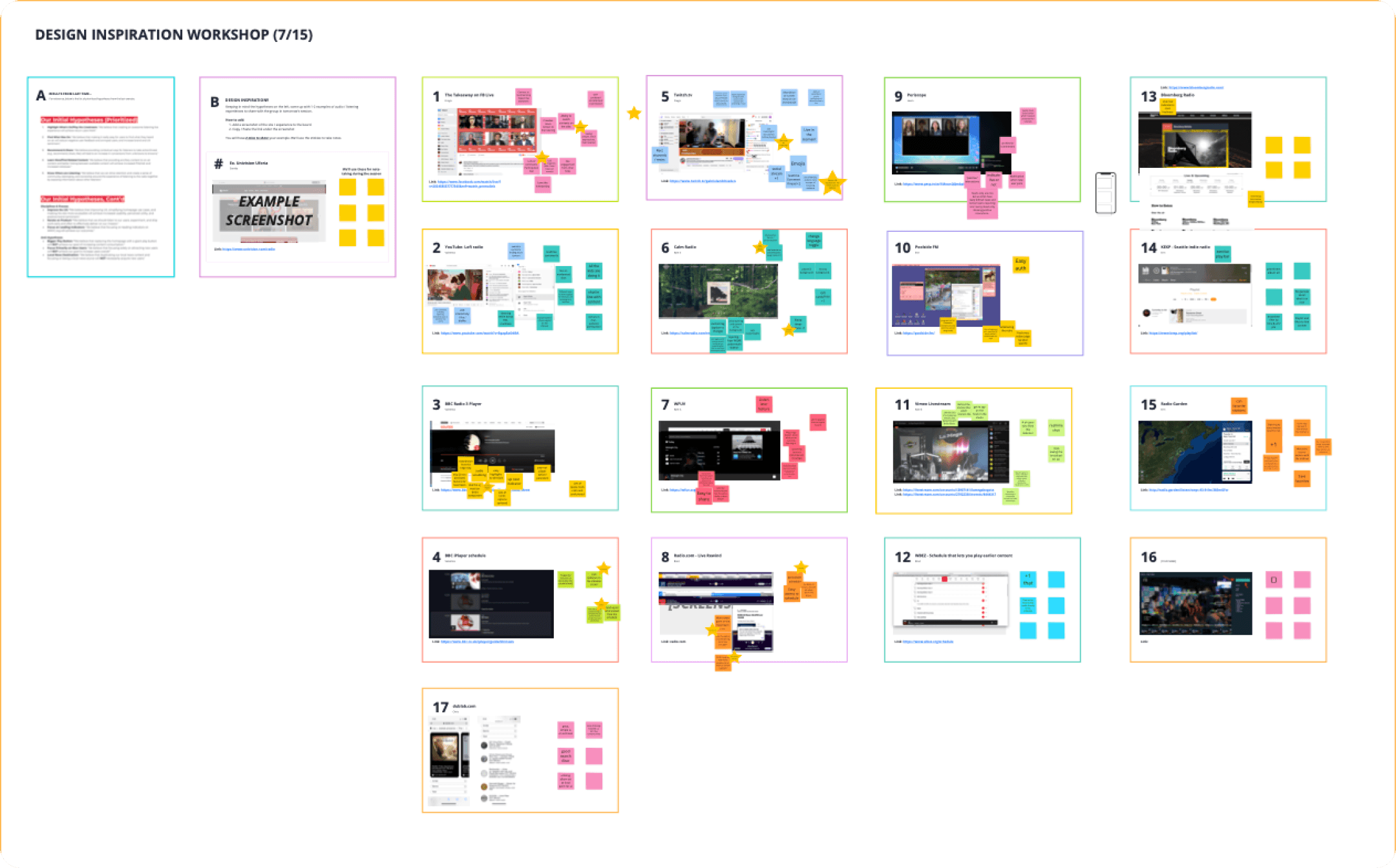
Design thinking workshop - Led remote team workshops (gather inspiration, feature ideation)
Design thinking workshop - Led remote team workshops (gather inspiration, feature ideation)
Evaluation research - Conducted two rounds of usability testing of the final product and a user preference test
Evaluation research - Conducted two rounds of usability testing of the final product and a user preference test
Tools used - Figma, Miro, Usertesting.com
Tools used - Figma, Miro, Usertesting.com
The team
The team
The team
Product manager
Design systems & visual leads
Content creation teams
Engineering manager
2 Engineers (FE + BE)
Operations lead
Data science
Product manager
Design systems & visual leads
Content creation teams
Engineering manager
2 Engineers (FE + BE)
Operations lead
Data science
Product manager
Design systems & visual leads
Content creation teams
Engineering manager
2 Engineers (FE + BE)
Operations lead
Data science
Context
Context
Context
WNYC is the largest public radio station in the U.S., reaching over 1 million listeners each week. While many still tune in via traditional radio, new audiences are more likely to discover WNYC through digital channels. However, the website (WNYC.org) hadn’t been updated in over 5 years.
This presented an opportunity to reimagine the digital listening experience—one that better serves existing users while attracting a new generation of listeners. How might we use this as a foundation for a more modern, engaging, and listener-focused WNYC.org?
The problems
The problems
The problems
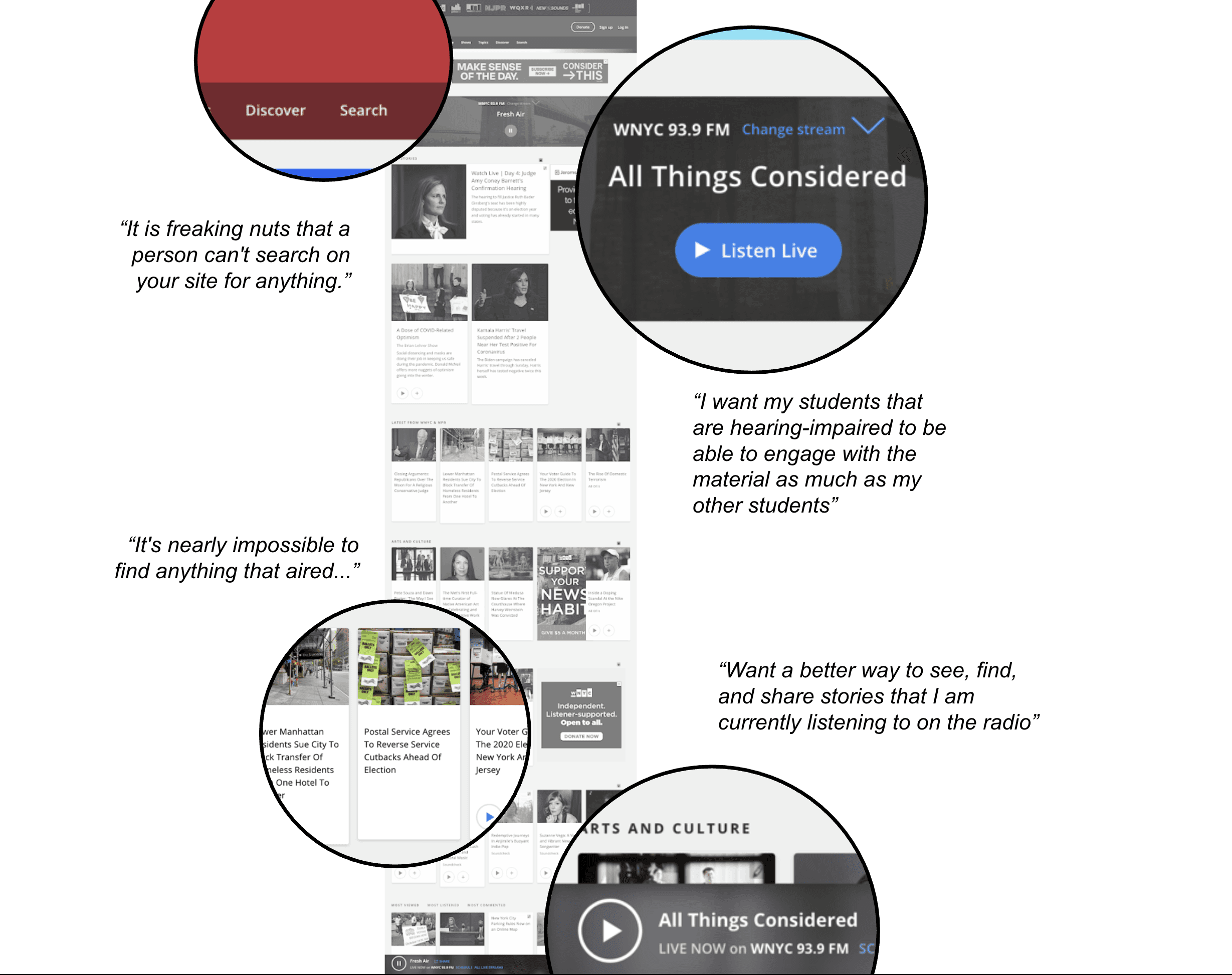
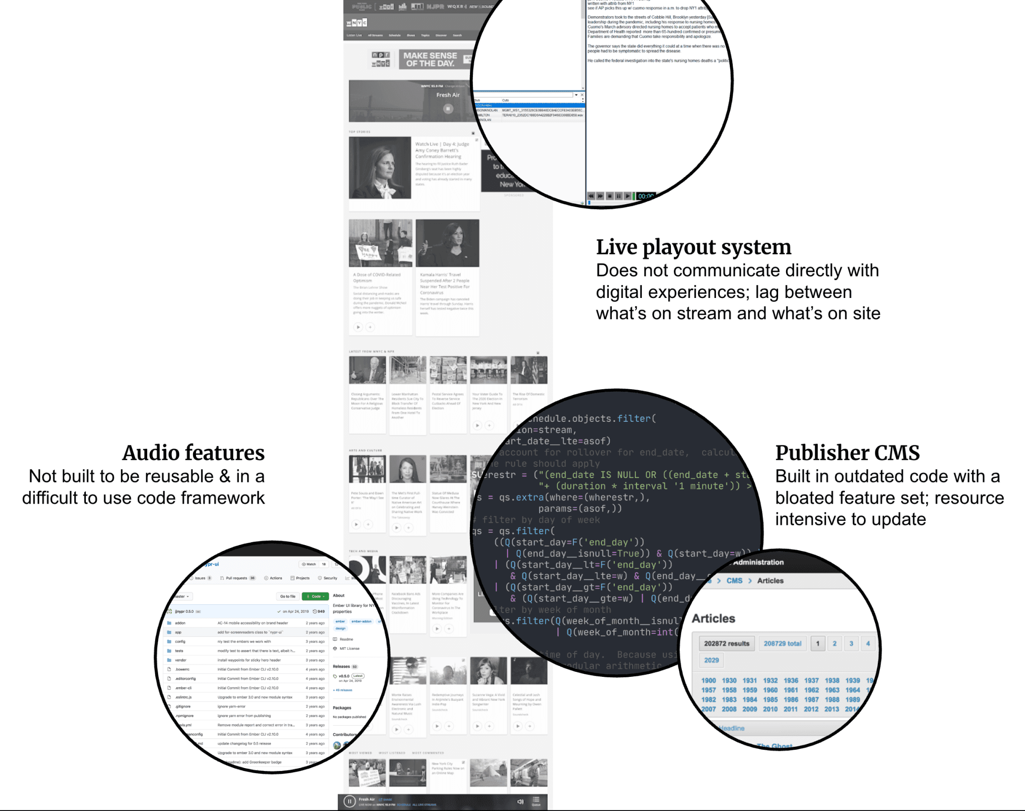
WNYC’s digital listening experience was built on a fragmented UX and legacy technical foundation that made live content difficult to access, discover, and share. Navigating and accessing our live listening experience was especially challenging for users with accessibility needs. As the platform and audience grew, these limitations increasingly inhibited editorial goals, degraded performance, and prevented the product from scaling sustainably.
UX Problems
The main WNYC live listening experience was not accessible to all users
The main WNYC live listening experience was not accessible to all users
“I want my students that are hearing-impaired to be able to engage with the material as much as my other students.”
“I want my students that are hearing-impaired to be able to engage with the material as much as my other students.”
Live listening and search was broken...often
Live listening and search was broken...often
It was very difficult to find the episode/segment that was playing live. Search was ineffective due to the legacy codebase. In order to enable effective search, we needed to rebuild the site.
“I want a better way to see, find, and share stories that I am currently listening to on the radio.”
It was very difficult to find the episode/segment that was playing live. Search was ineffective due to the legacy codebase. In order to enable effective search, we needed to rebuild the site.
“I want a better way to see, find, and share stories that I am currently listening to on the radio.”
Tech Problems
Page speed for the legacy site was slow and inconsistent
Page speed for the legacy site was slow and inconsistent
The original codebase was outdated and difficult to update. It was not able to communicate directly with the live playout system, causing lags and sometimes, blackouts, between the live stream and the digital stream.
The original codebase was outdated and difficult to update. It was not able to communicate directly with the live playout system, causing lags and sometimes, blackouts, between the live stream and the digital stream.
Components were difficult to repair or reuse
Components were difficult to repair or reuse
The lack of a design system and the antiquated codebase meant that we had to continuously rebuild a lot of the same components. We had an experience that was disjointed and difficult to navigate.
The lack of a design system and the antiquated codebase meant that we had to continuously rebuild a lot of the same components. We had an experience that was disjointed and difficult to navigate.
Problem statement
Problem statement
We did not have the time or resources to completely overhaul the complete WNYC.org site. That said, "patching things up" had been the approach thus far and was no longer possible. So how might we start creating an accessible, scalable live listening experience that works reliably for users and enables our teams to evolve the platform over time?
We did not have the time or resources to completely overhaul the complete WNYC.org site. That said, "patching things up" had been the approach thus far and was no longer possible. So how might we start creating an accessible, scalable live listening experience that works reliably for users and enables our teams to evolve the platform over time?
Design vision
Design vision
Create a more efficient, usable, and innovative listening focused experience that we can learn from and gradually use to reimagine a new WNYC.
Create a more efficient, usable, and innovative listening focused experience that we can learn from and gradually use to reimagine a new WNYC.
Create a more efficient, usable, and innovative listening focused experience that we can learn from and gradually use to reimagine a new WNYC.
Solution
Solution
Solution
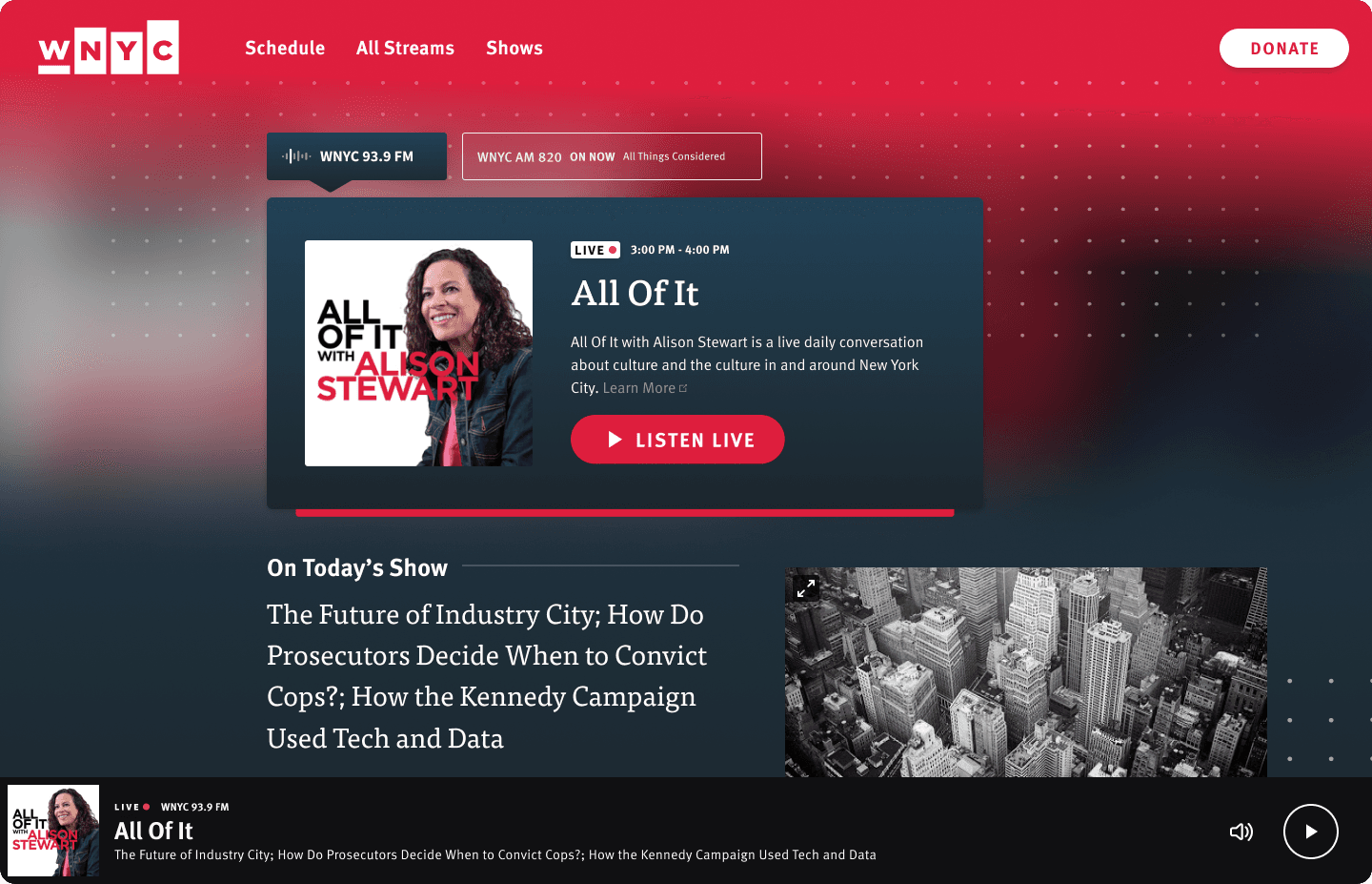
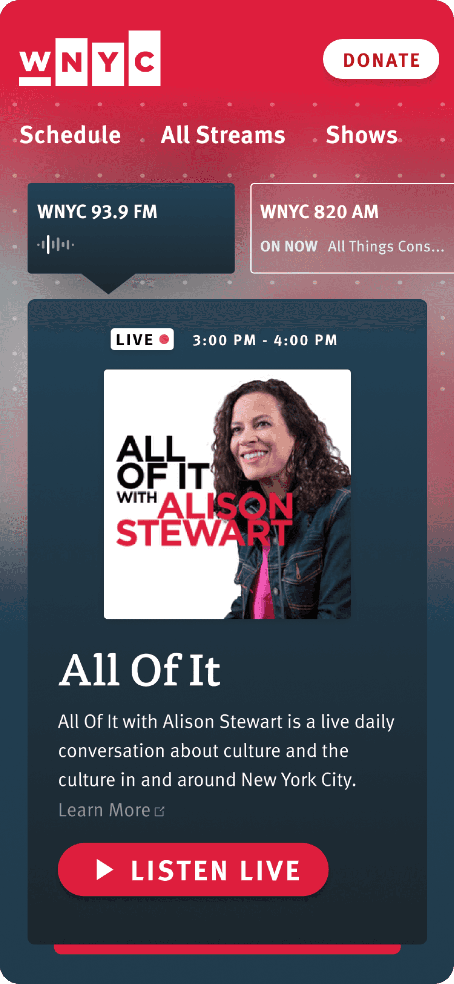
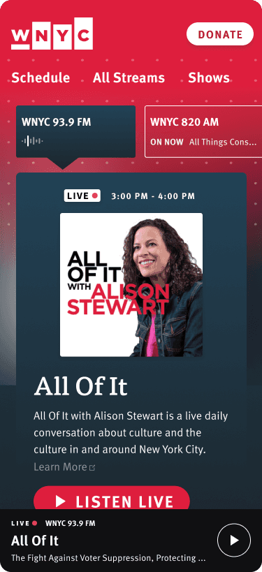
We created an MVP concept for a new listening focused WNYC.org site. The main components for this initial launch are the following:
We created an MVP concept for a new listening focused WNYC.org site. The main components for this initial launch are the following:
Main player - How can users see what’s on AM and FM and listen?
Episode + Segment + Images - How can users learn more about today’s show?
Host + Social follow - How can users connect directly with our shows on platforms they already use?
Main player - How can users see what’s on AM and FM and listen?
Episode + Segment + Images - How can users learn more about today’s show?
Host + Social follow - How can users connect directly with our shows on platforms they already use?
01
Main player
The main player was the main feature of our reimagined live listening experience. Users can see what’s on now for both FM and AM from the main page.
The main player was the main feature of our reimagined live listening experience. Users can see what’s on now for both FM and AM from the main page.
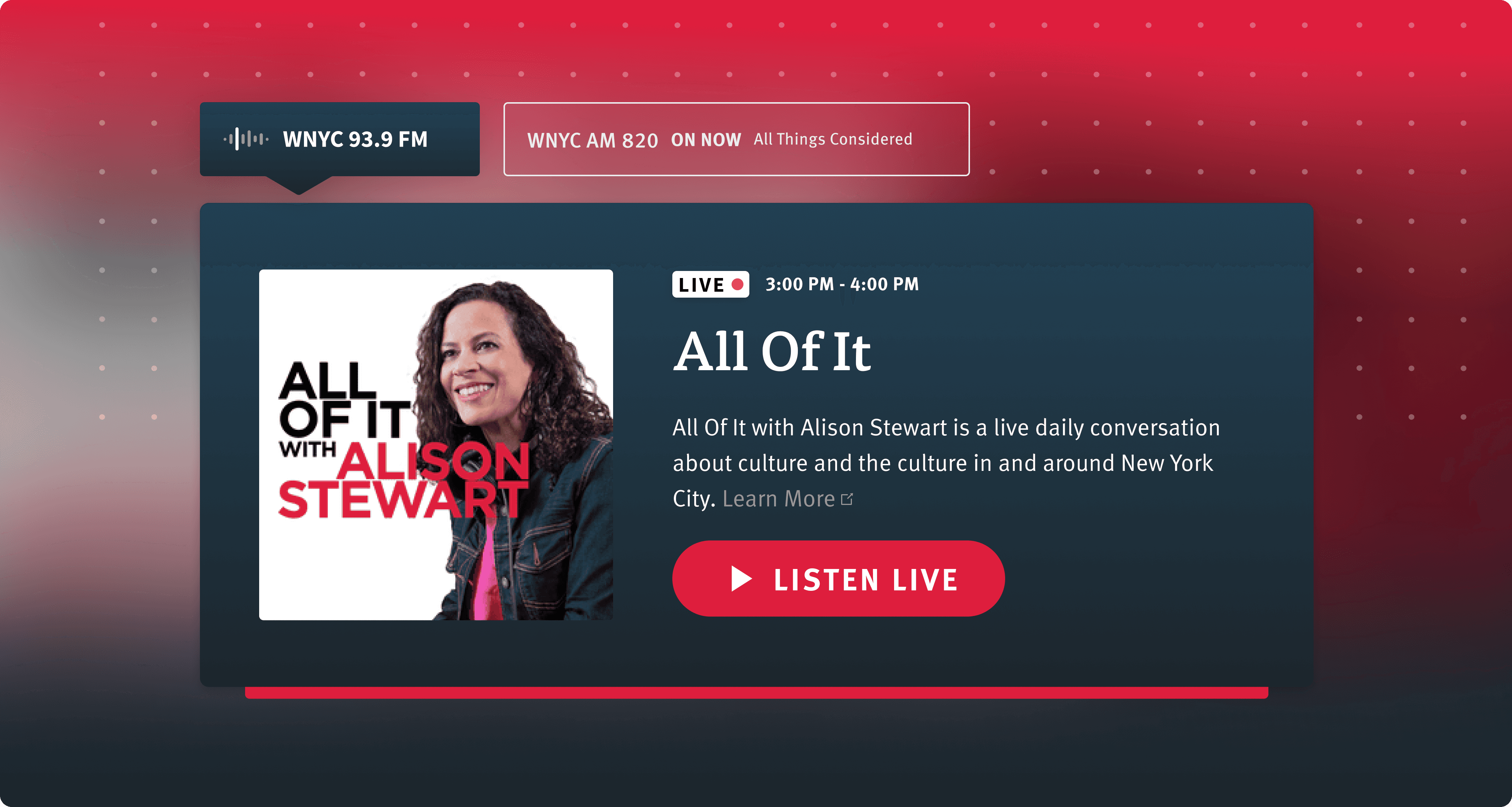
Key features and rationale:
Key features and rationale:
Stream switcher
Stream switcher
Our data indicated that many users come to our main site and switch between both AM and FM streams to see what’s on before playing. Right off the bat, users can see what’s on both streams without having to click around.
Our data indicated that many users come to our main site and switch between both AM and FM streams to see what’s on before playing. Right off the bat, users can see what’s on both streams without having to click around.
Show art
Show art
Show art goes beyond NYPR owned & operated properties. They appear on Spotify, Apple podcasts, etc. and tend to grab our user’s attention.
Show art goes beyond NYPR owned & operated properties. They appear on Spotify, Apple podcasts, etc. and tend to grab our user’s attention.
Show description
Show description
People that are new to our site and/or have never hear of WNYC or NPR, are not familiar with our shows. Some of the names such as “All Of It” or “The Brian Lehrer Show” don’t provide enough information. The show description helps new users get a sense of what the show is about.
People that are new to our site and/or have never hear of WNYC or NPR, are not familiar with our shows. Some of the names such as “All Of It” or “The Brian Lehrer Show” don’t provide enough information. The show description helps new users get a sense of what the show is about.
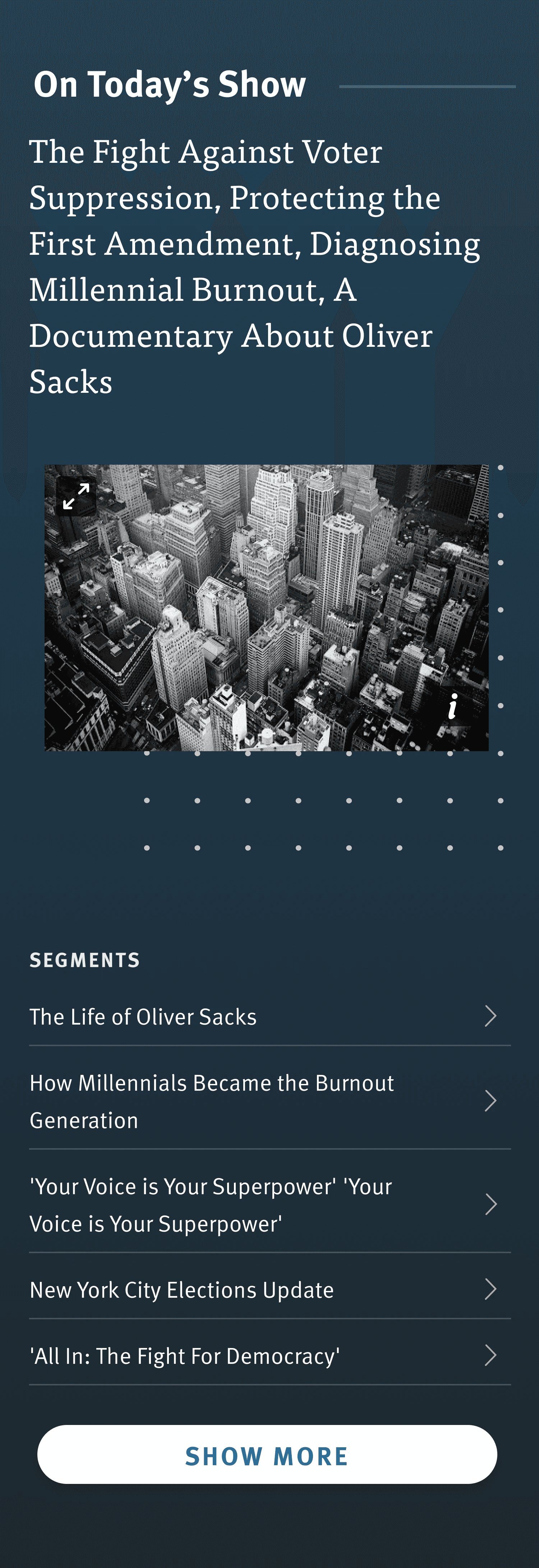
02
Episode + segments + image
To enhance the digital live listening experience, we also wanted to elevate the content that our show teams produce and gives users a way to dig into the stories that interest them.
To enhance the digital live listening experience, we also wanted to elevate the content that our show teams produce and gives users a way to dig into the stories that interest them.
Key features and rationale:
Key features and rationale:
Episode title + segment list
Episode title + segment list
This gives users a quick summary of today’s episode. For new users unfamiliar with our programming, this also gives them a better idea of what kinds of topics the on-air show covers.
This gives users a quick summary of today’s episode. For new users unfamiliar with our programming, this also gives them a better idea of what kinds of topics the on-air show covers.
Episode image
Episode image
While looking through our CMS and through the show pages on our WNYC site, I notices most of these shows have images associated with each episode. By adding it to the main page, we hoped it would draw in newer listeners and add a visual storytelling element to what is traditionally an audio focused medium.
While looking through our CMS and through the show pages on our WNYC site, I notices most of these shows have images associated with each episode. By adding it to the main page, we hoped it would draw in newer listeners and add a visual storytelling element to what is traditionally an audio focused medium.

03
Host + Social follow
One of the themes that kept coming up in user research was the strong connection users have with our hosts.
One of the themes that kept coming up in user research was the strong connection users have with our hosts.
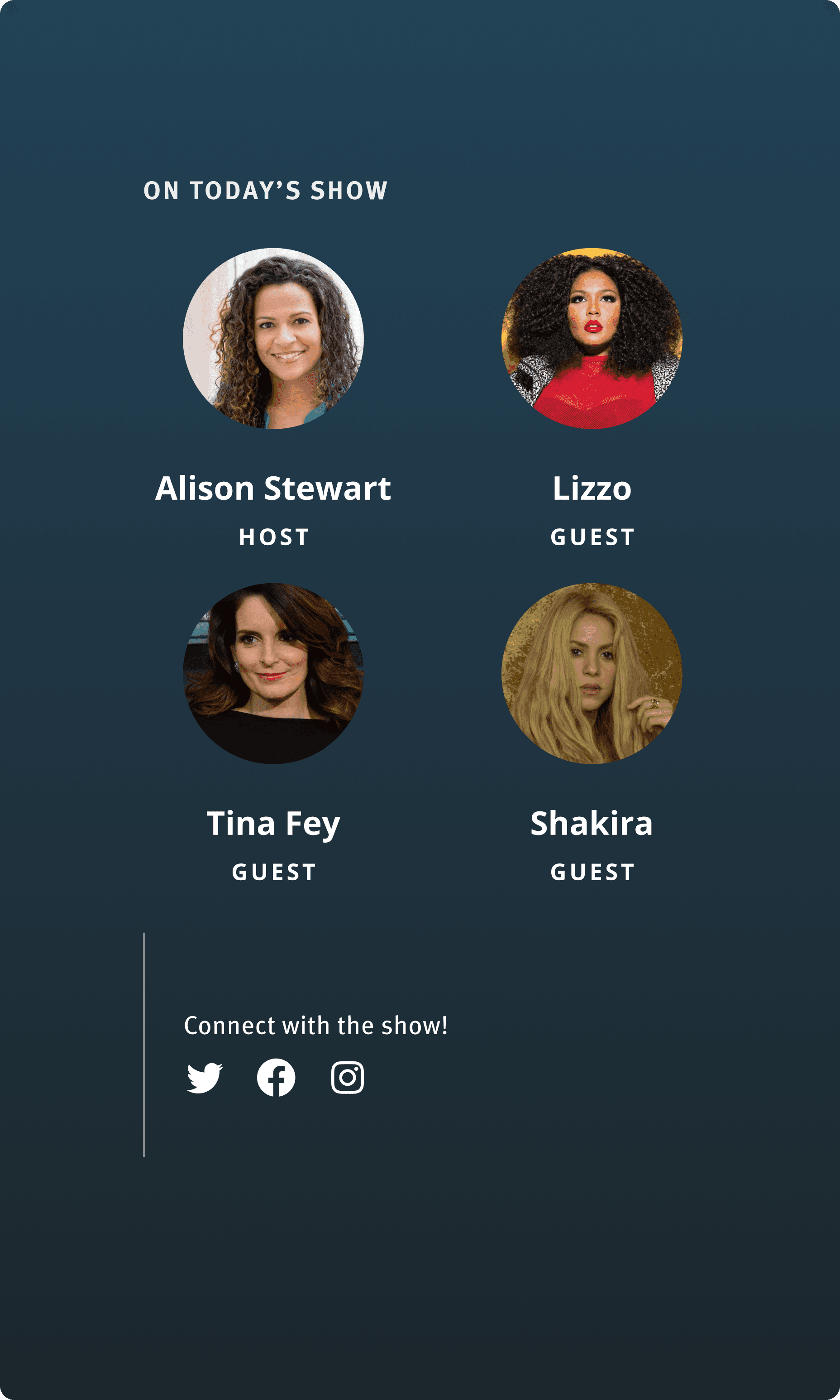
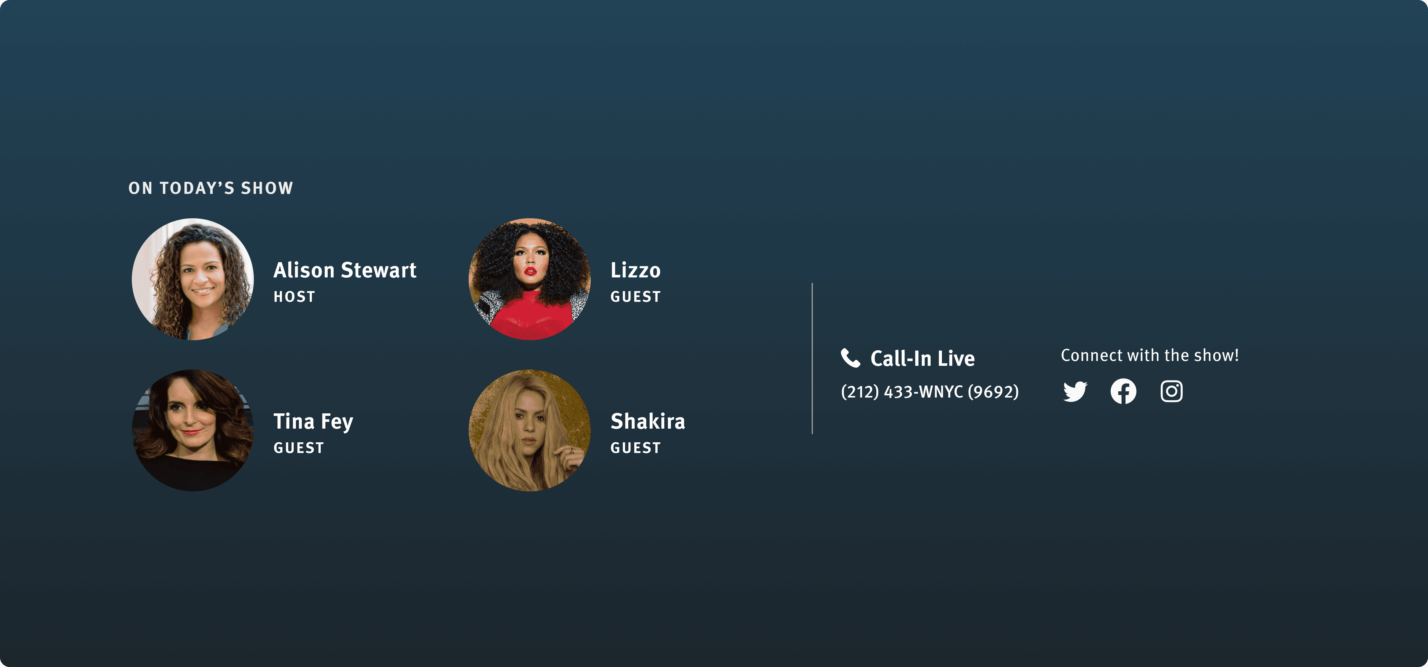
Key features and rationale:
Key features and rationale:
Host information
Host information
We learned in a previous MVP (for WQXR), that while our audiences loved our hosts, they didn’t know what they looked like. But they enjoyed being able to put faces to their favorite hosts. In this experience, we incorporated images to further support that connection with news / talk hosts.
We learned in a previous MVP (for WQXR), that while our audiences loved our hosts, they didn’t know what they looked like. But they enjoyed being able to put faces to their favorite hosts. In this experience, we incorporated images to further support that connection with news / talk hosts.
Social follow
Social follow
Another way we wanted to facilitate that connection with the shows and hosts, was by surfacing any available social accounts. Users will be able to keep up with the show when they have special guests or episodes.
Another way we wanted to facilitate that connection with the shows and hosts, was by surfacing any available social accounts. Users will be able to keep up with the show when they have special guests or episodes.
Our approach
Our approach
Our approach
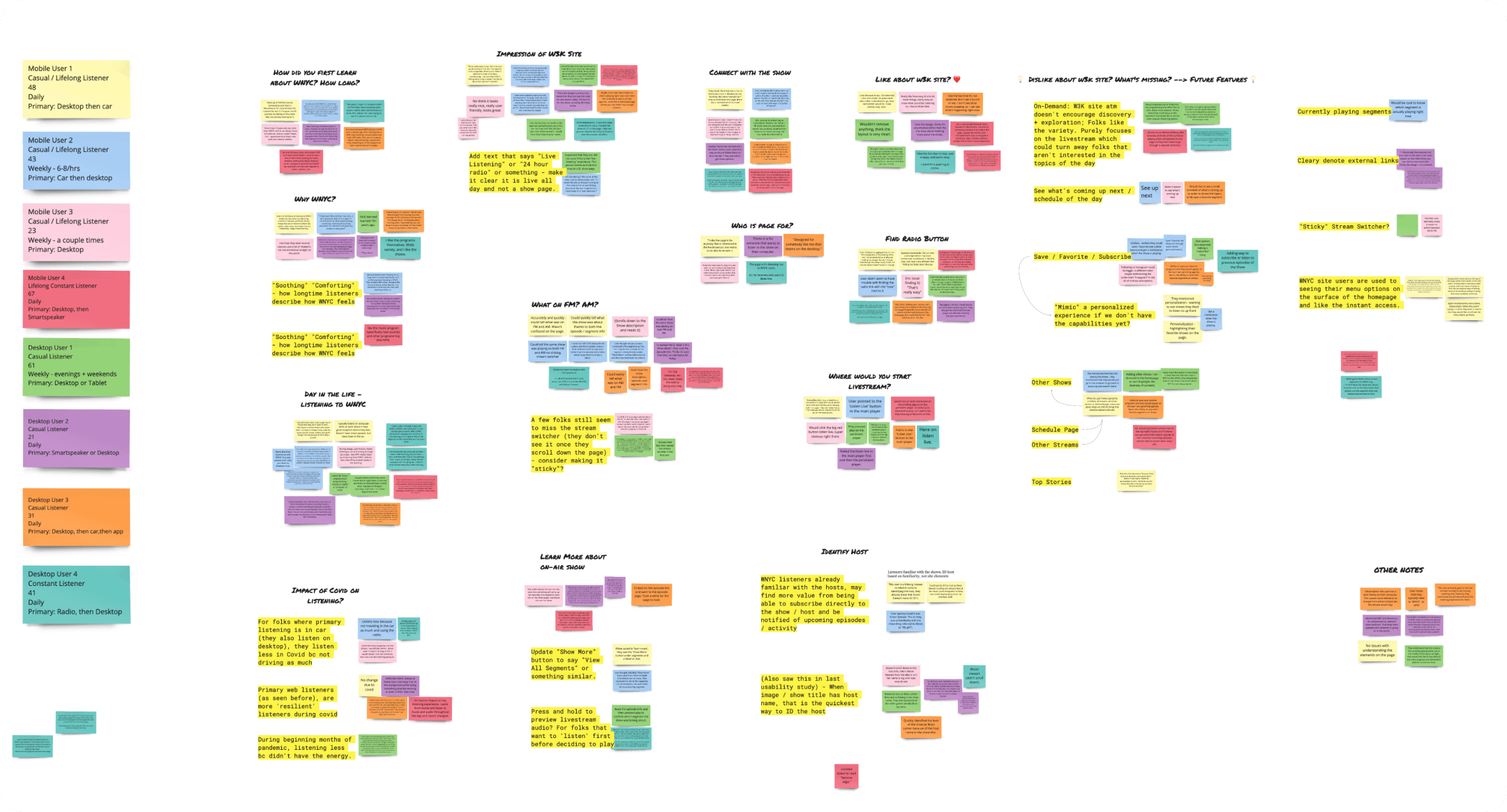
Our process began with research and real user data. We wanted to understand how people used our site and why they kept coming back, especially our habitual listeners.
For WNYC, we had many users that tuned in for extended live radio sessions. Learning their pain points and understanding what kept them engaged helped us ensure we were meeting their core needs. This also helped us hone in on key features we could elevate for new users.
01
Research & discovery
We began by analyzing actual site behavior and identifying friction points. Through interviews and user journey mapping, I uncovered key needs for both loyal listeners and casual users.
We began by analyzing actual site behavior and identifying friction points. Through interviews and user journey mapping, I uncovered key needs for both loyal listeners and casual users.
Site analytics review
User interviews
Personas & journey mapping
Site analytics review
User interviews
Personas & journey mapping
Insight:
Insight:
Listeners highly valued the "listen live" feature, but struggled to find further information about the live show or learn more about the shows.
Listeners highly valued the "listen live" feature, but struggled to find further information about the live show or learn more about the shows.
02
Ideation & strategy
Taking the learnings from our research, I planned and ran a couple of ideation workshops across different teams. This helped the team get ideas out and come to a shared vision for future audio experiences.
Taking the learnings from our research, I planned and ran a couple of ideation workshops across different teams. This helped the team get ideas out and come to a shared vision for future audio experiences.
Cross-functional ideation workshops
Audio UX guidelines
Feature prioritization
Cross-functional ideation workshops
Audio UX guidelines
Feature prioritization
Outcome:
Outcome:
We established shared principles for an audio-first experience and landed on key features for the MVP.
We established shared principles for an audio-first experience and landed on key features for the MVP.
03
Refinement
I collaborated with PMs, engineers, and design system leads to define and prototype the MVP experience. We balanced speed and scalability by building the foundations early while continuing to refine the final design.
I collaborated with PMs, engineers, and design system leads to define and prototype the MVP experience. We balanced speed and scalability by building the foundations early while continuing to refine the final design.
Wire-framing
Prototyping
Theme ideation
Final MVP feature prioritization
Wire-framing
Prototyping
Theme ideation
Final MVP feature prioritization
Collaboration:
Collaboration:
I worked closely with engineering to ensure accessibility and system alignment from day one. With the lead PM, we were able to hone in on the most important features that fit within a reasonable timeline.
I worked closely with engineering to ensure accessibility and system alignment from day one. With the lead PM, we were able to hone in on the most important features that fit within a reasonable timeline.
04
Hand-off & testing
Final designs were handed off with built-in flexibility for iteration during the build. I performed design QA throughout the build to speed delivery. Post-launch, I ran a user preference test, and worked with PM and Engineering on final tweaks.
Final designs were handed off with built-in flexibility for iteration during the build. I performed design QA throughout the build to speed delivery. Post-launch, I ran a user preference test, and worked with PM and Engineering on final tweaks.
Developer handoff
Design QA
User preference testing
Iterative fixes and improvements
Developer handoff
Design QA
User preference testing
Iterative fixes and improvements
Result:
Result:
Our launch met accessibility, performance, and engagement goals. We were also able to build upon our new design system and laid the groundwork for more seamless audio experiences.
Our launch met accessibility, performance, and engagement goals. We were also able to build upon our new design system and laid the groundwork for more seamless audio experiences.

Results
Results
Results
We tested the live product with users after launching to determine what improvements to make in the next release. We also took this opportunity to test a couple concepts we mocked up for a potential future release.
We tested the live product with users after launching to determine what improvements to make in the next release. We also took this opportunity to test a couple concepts we mocked up for a potential future release.
Preferred experience
Preferred experience
62% research participants preferred the new design over the old experience. Some of the other 38% were simply used to the old experience. Others were missing some of the navigation links from the old experience. We were able to quickly add in links to the “All Streams”, “Schedule”, and “Shows” for those users.
62% research participants preferred the new design over the old experience. Some of the other 38% were simply used to the old experience. Others were missing old links so we quickly added those as a quick fix.
62% research participants preferred the new design over the old experience. Some of the other 38% were simply used to the old experience. Others were missing old links so we quickly added those as a quick fix.
Improved accessibility
Improved accessibility
Accessibility score increased from 83 to 100.
Accessibility score increased from 83 to 100.
Improved page speed and audio quality
Improved page speed and audio quality
Page speed increased by 44% and live audio quality improved with fewer outages.
Page speed increased by 44% and live audio quality improved with fewer outages.
Control (Original site)
Control (Original site)
Control (Original site)
Test (New live design)
Test (New live design)
Test (New live design)
For a deeper dive into this case study
For a deeper dive into this case study
For a deeper dive into this case study
Get in touch:
Get in touch:
Get in touch:
Copy email
danielam.hola@gmail.com
Copy
danielam.hola@gmail.com
Copy